A Colorful Story: The Life of Everland’s Color Designer
June 15, 2018
Samsung C&T Global PR Manager
We typically associate communication with words, gestures and facial expressions in our daily lives. Rarely are we conscious of how the different shades and hues of our surroundings affect the way we feel. Yet it doesn’t take much to realize that colors can shape our moods just as effectively as an upbeat song or a sad movie.
Imagine a theme park that’s entirely grey. Even with the most thrilling rides and performances on offer, it would not be a place where many would want to return to.
A Colorful Journey
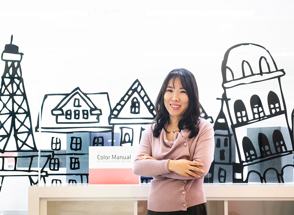
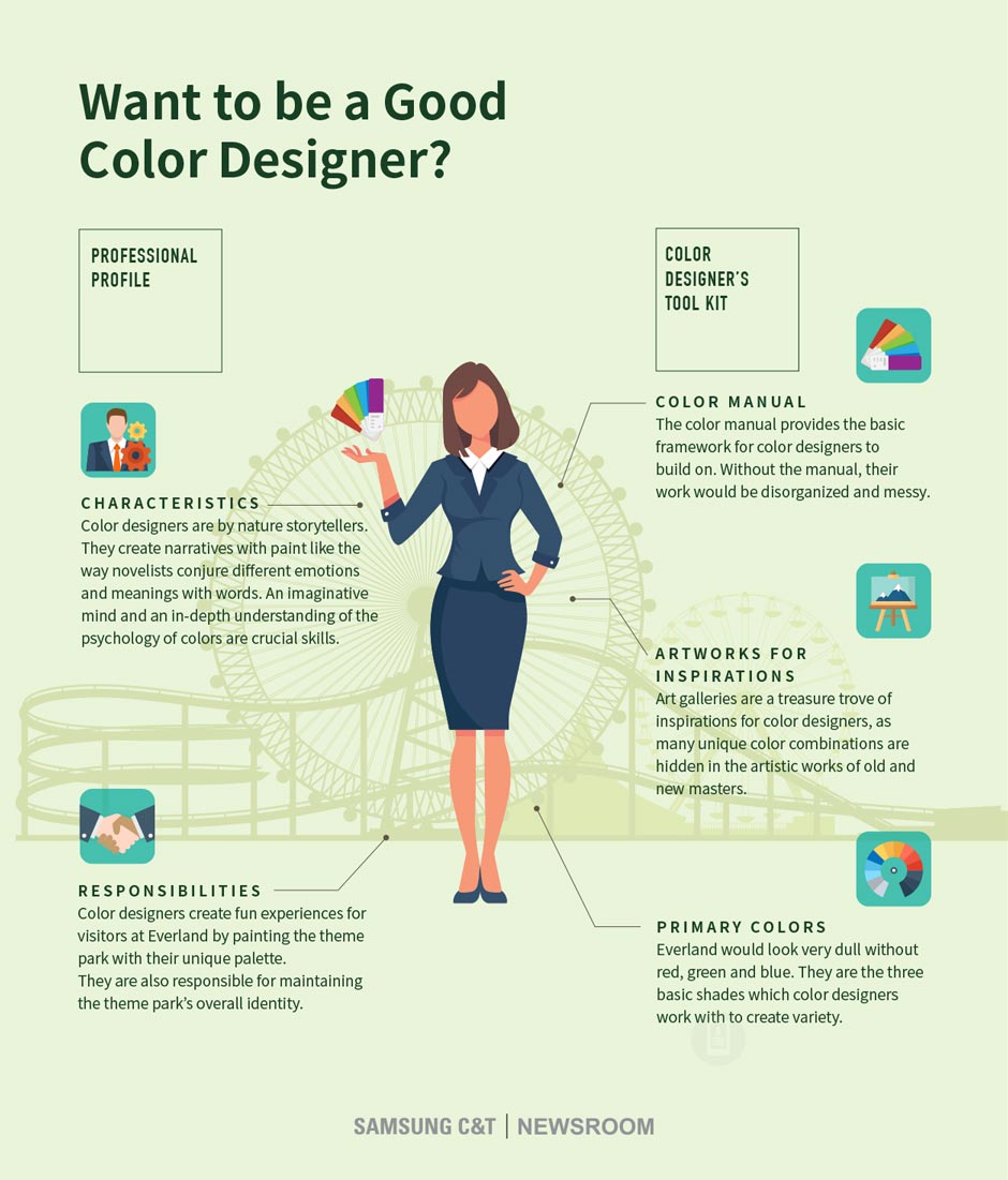
Color designer Jung-eun Kim is one of the masterminds behind Everland’s vibrant appearance. Trained as a painter in college, she grew up wanting to be an artist.
“But I later realized that it’s difficult to connect with many people if I make fine art alone,” she says.
Kim’s search for other way to bring meaning and joy to people through art soon brought her to Everland, where she has been working as a color designer for 16 years.
Space, Shades and Stories
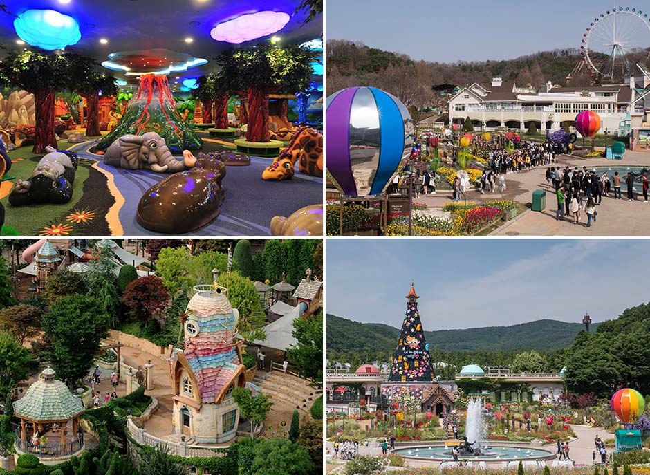
On the surface, Everland’s vibrant palette appears to be randomly assembled. But in fact, the color scheme of the theme park is the result of meticulous planning behind the scenes.
“In many ways, designing the color scheme of Everland is similar to decorating various rooms in a house, only on a much larger scale,” says Kim. “We use colors to tell different stories around Everland, while also making sure all the components come together coherently.”
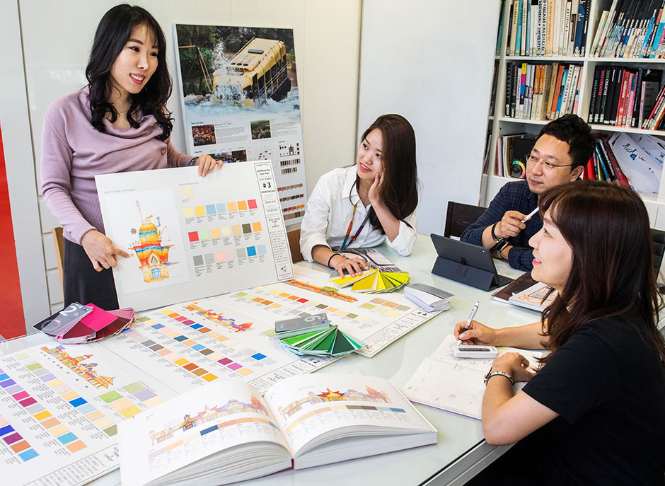
Maintaining Everland’s unique color identity can be difficult when the theme park spreads over such wide area. To make sure their creations are focused, Kim and her team rely heavily on Everland’s Color Manual whenever they design a new zone.
“The manual gives us a solid foundation to build on,” says Kim. “It helps us tell better stories and create unique experiences.”
Color Designer in Action
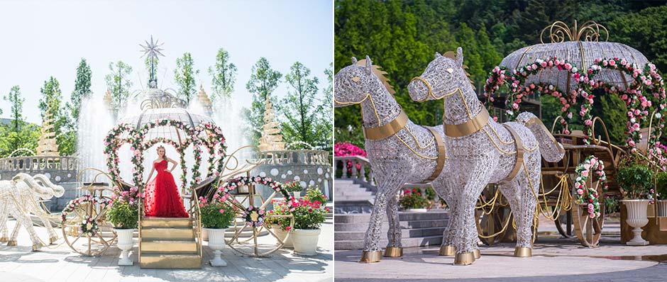
To see the works of Kim and her team, visitors need to look no further than Everland’s Rose Festival. The team took the dazzling gardens to new heights by painting statues and installations with vibrant colors that sit in perfect harmony with the flowers on display.
“For the festival, I chose colors that evoke a sense of childhood excitement,” Kim says. “It’s a wonderful feeling when I see people smile with pure joy when they walk through the gardens.”
Think you’ve got what it takes to be a color designer? Take a look at the infographic below to learn more!