Color is a power which directly influences the soul,” Russian artist Wassily Kandinsky wrote. It should be little surprise, then, that building designers take color so seriously among their many aesthetic considerations. Standing out in a metropolis is a challenge for anyone – or anything.
This is where Samsung C&T’s Product Design manager Lee Mi-jin comes in. She first joined the company’s Engineering & Construction Group in 2006 as a color expert. She had headed the Urban Environment Team for Korea Color Research Institute before that. Now she is responsible for designing the exteriors of Raemian apartment buildings – Raemian being Samsung C&T’s premium apartment brand.
All the world’s a stage… or canvas
Lee’s canvas is South Korea’s capital, Seoul, which offers a post-Korean War cityscape in which skyscrapers have only relatively recently been competing for bragging rights. This contest arguably expresses itself most clearly along the Han River, which intersects modern Seoul in every sense. Even the iconic Gangnam district owes its name to its location – being “nam,” or south, of the “gang,” or river.
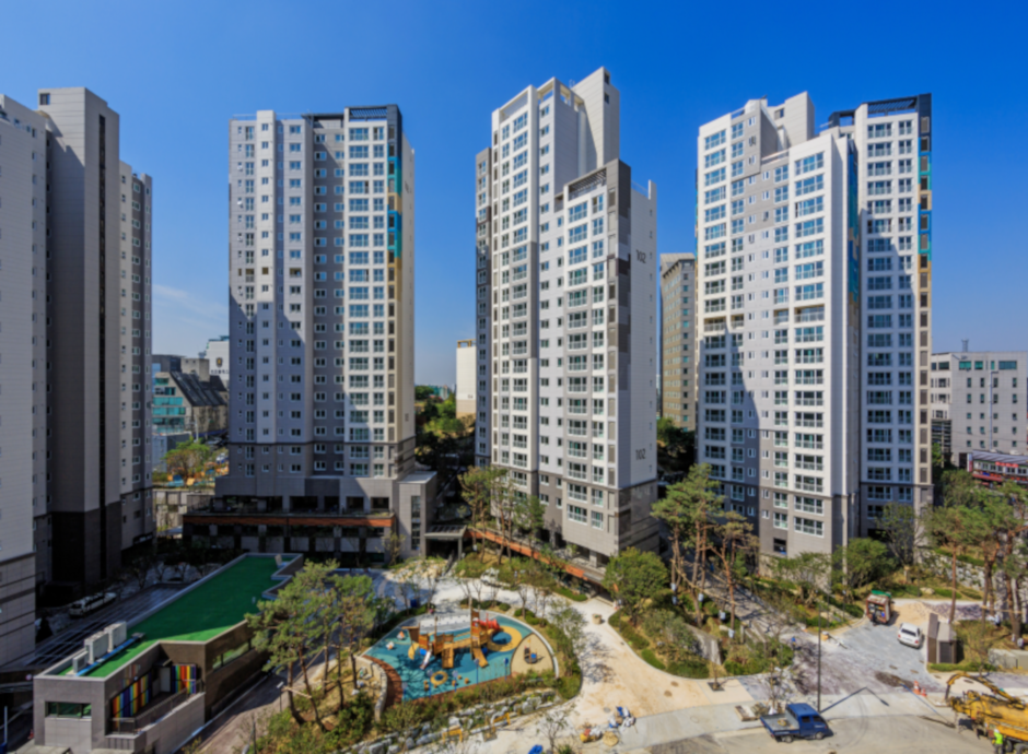
For apartments next to the Han, Lee concedes that “settling on the right shades of blue was particularly tough.” Raemian first adopted “ocean blue” as a color scheme for its Mapo Yonggang, Sangsu 1 and 2, and Hyeonseok buildings.
“Because these complexes are located along the river and highly visible, we needed something that could make the buildings stand out,” Lee says, as she also came up with a sidewall design, or Raemian Luxury Tag. “I am particularly fond of these projects because they took a lot of hard work, and I am proud of the fact that even to this day these complexes stand out when one looks upon the row of apartment buildings along the northern side of the Han River.”
Courage to choose the perfect color
Lee’s designs might seem a little more practical than the abstract world of Kandinsky, but their views on color are not so far apart.
“Colors play aesthetic, functional, and even psychological roles in our lives, and it’s the job of colorists like me to figure out how to best manipulate those roles,” she explains.
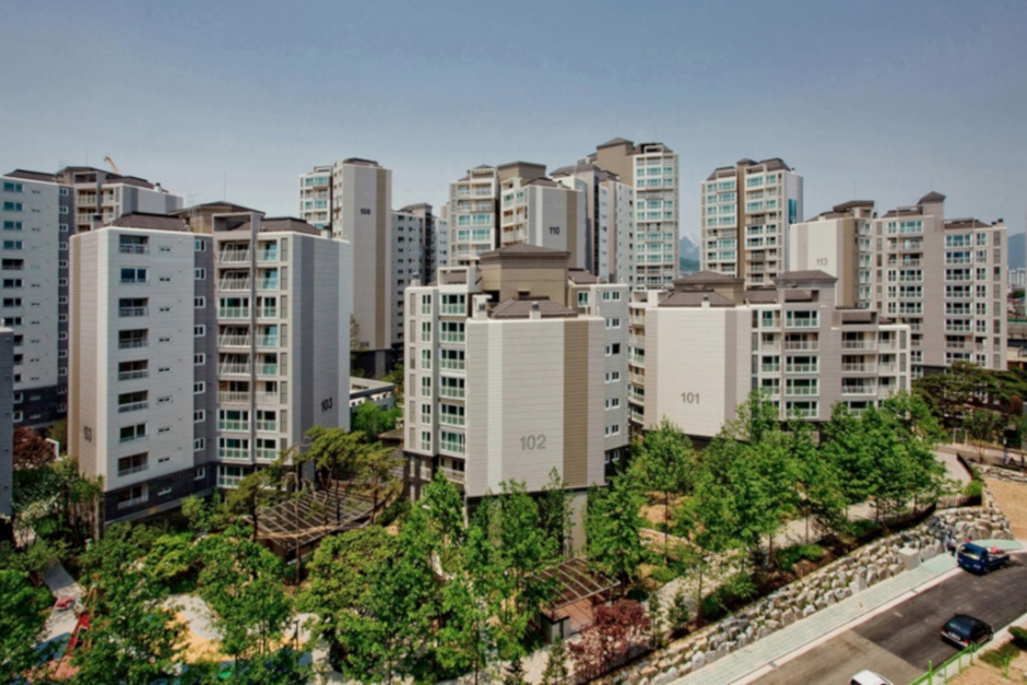
The Seokgwan 1 project is another strong example of color playing an important role in Lee’s work, as it was the first Raemian complex to be painted “chic brown.”
“We conducted multiple tests on the buildings to find the perfect shade of brown,” she says. “When it comes to color schemes, it’s not possible to find one that makes everyone happy. So, committing to a color scheme for an apartment complex takes a lot of courage.”
Her choice of brown stuck, and is now part of a unique set of paint codes with a major paint manufacturer. While she insists “every project is special and unique,” Lee admits Seokgwan 1 is particularly memorable.
Shades of gray
It becomes clear in the world of colorists that shades and tones can be transformative, so that even “the same group of colors can express entirely different emotions,” as Lee puts it.
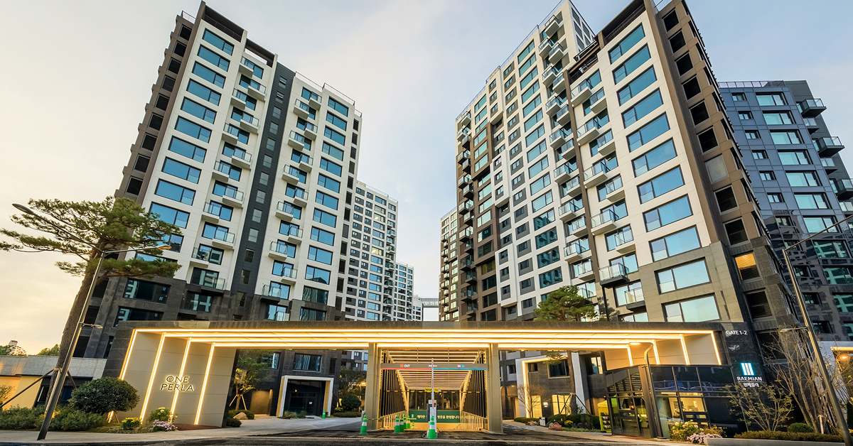
Gray, for example, was associated with calm and relaxing preferences in the past. But gray is also part of a movement toward extravagance and individuality.
“The latest trend in apartment color schemes is invoking a sense of exclusivity by combining dark shades of gray with low-saturation colors for high contrast,” Lee says. “In this current environment, making an apartment complex stand out in terms of its color scheme probably means going back to shades of gray.”
The outsider
Lee’s exterior design transcends color, however. She says her focus is on “everything the resident sees once they step out of their apartment unit.”
That includes structures, sculptures, gardens, complex entrances, common areas, pilotis, underground parking, signage, and so on.
“I describe myself as a makeup artist for buildings,” she explains. “As such, my job is to make buildings look their best by accentuating certain features while making other features less prominent.”
And, of course, the paintbrush is still a vital tool in that regard. Lee says her “next great challenge will be to find a unique color scheme to symbolize the brand,” while retaining Raemian’s reputation for shades that are “somehow a little bit more elegant and a little bit more graceful.”


