“There is nothing like staying at home for real comfort,” Jane Austen wrote in her 1815 novel Emma. That may ring true for many people, but it does not mean that every house or apartment offers the comfort of home. That kind of comfort is made up not only of furniture but also memories – and it can be decided at the beginning, at the design stage.
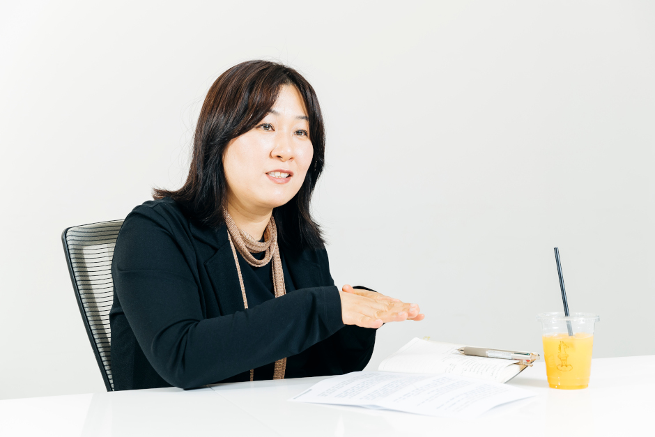
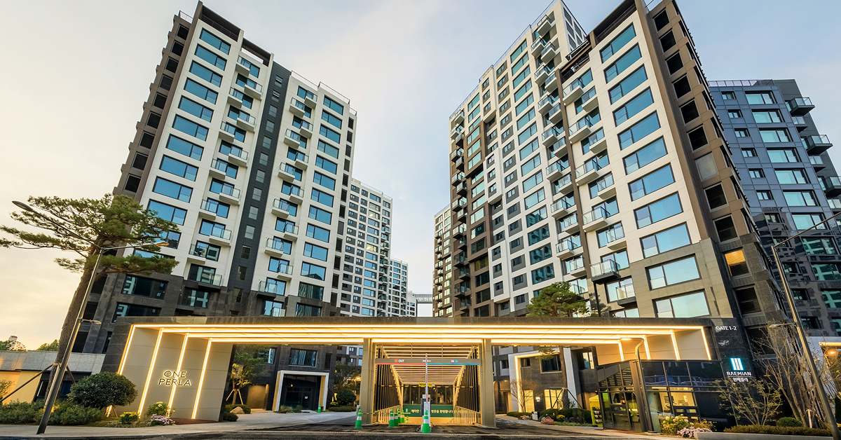
This idea of “turning apartments into homes” is a task that has been taken on by Kum Gui-sun, who designs residential interiors for Samsung C&T’s Engineering & Construction Group. She has been working on the company’s Raemian apartment brand for 20 years, during which time she has seen the transformation of home buyers in South Korea after initially “not caring much” about interior design.
A blueprint for home comfort
“Because the home is where we feel most relaxed, designing the interior of an apartment is probably the most challenging subset of interior design,” Kum explains. “An apartment’s interior design has to be more than just pretty and trendy. It has to take into consideration factors like movement of the residents inside the apartment and efficient use of space.”
She reflects that “people often mistakenly believe an apartment’s interior refers only to superficial elements like wall colors and types of finishing materials.” Instead, she stresses, the structural layout of an apartment accounts for “more than 50% of its interior design.” This means that Kum spends a great deal of time on things like the floor plan and furniture arrangement, as these factors affect considerations such as storage space.
And even when it comes to appearances, Kum feels that critical analysis and future planning are even more important than fundamental capabilities like having a keen eye for how different shapes and colors affect emotional responses.
Responding to real needs
For Kum, designing an apartment’s interior requires her to step beyond the abstract into “the real-world thoughts and opinions of people.”
As her design team’s director, she gathers the views of colleagues such as working moms, and they work closely with C-LAB, an advisory group made up of homemakers.
“We also visit existing Raemian complexes to learn more about the usability of our apartments and survey potential customers to find out how we might improve our future offerings,” Kum says.
This approach has produced some interesting designs, from the Kitchen Hub to the Boutique Bathroom. The latter has been on display at Raemian model homes for the past four years and is just now making its way into actual apartments – demonstrating how residential concepts and prototypes need a long time to test, improve, and validate before going public.
Rooms for rest and recreation
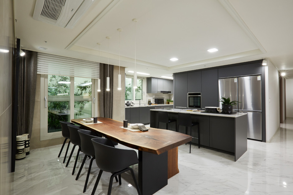
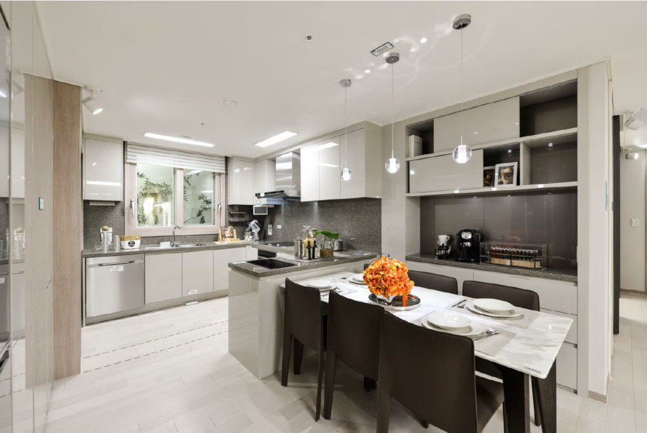
The Raemian Kitchen Hub received the coveted Good Design Award after it was introduced in 2016. Kum notes that families are spending even more time in the kitchen than the living room these days, and the Kitchen Hub was conceived with this trend in mind. It allows the homeowner to use the kitchen not just for cooking and eating but also as a tearoom or perhaps as a family study. “Parents can help kids with their homework and even entertain guests in the kitchen,” Kum explains.
Last year, Raemian additionally brought back its Open Kitchen concept, which may have been ahead of its time when it was first developed in the early 2000s.
“It was considered too radical and innovative and was set aside for more than ten years,” Kum admits. “This particular kitchen layout is popular with families that don’t spend a lot of time cooking in the kitchen and allows the resident to cook for, entertain, and serve guests all in the kitchen.”
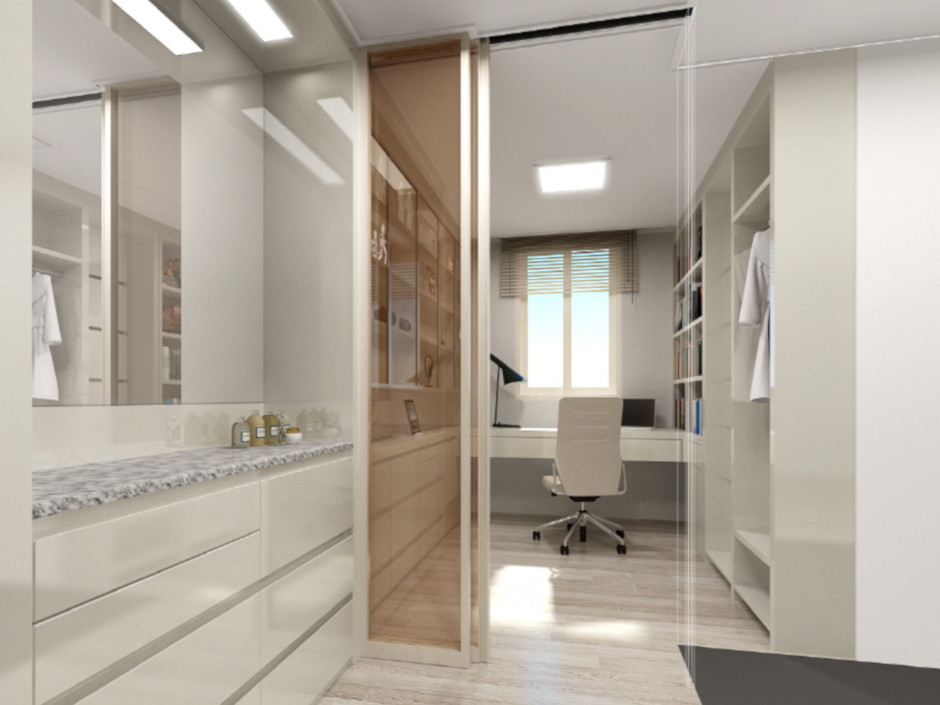
Sometimes, however, the comfort of home means being able to take oneself off to relax in a quiet study. The so-called Mister Room was designed in response to the growing trend of dads wanting a little private space to call their own. The Mister Room converts what might otherwise be a dressing room into an oasis of relaxation.
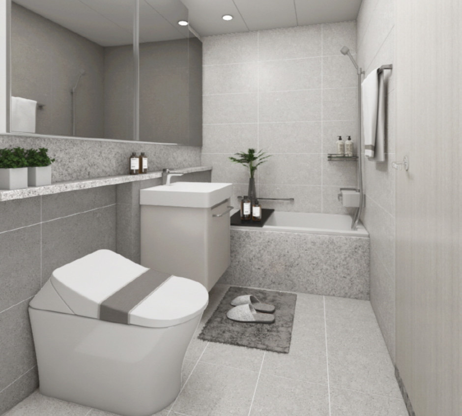
And then the Boutique Bathroom, while it may appear to be a typical washroom, is packed with features that epitomize Kum’s desire to respond to the real needs of residents.
Placing the faucet on the opposite side of where it would be expected to be is a convenience that allows people to easily shampoo their hair or wash their feet without having to take a full shower. Moreover, precise temperature controls are really helpful for parents bathing toddlers. “The idea behind all these faucet features came from designers who have real-world experience living in an apartment with small kids,” Kum reveals.
There are also mirrors covering the entire length of one of the walls to make the bathroom feel much bigger than it actually is and a stone shelf running all the way from one end of the room to the bathtub to provide more storage space. An extra cabinet underneath the sink is a feature that has been duplicated by other apartment brands since it was first developed by Samsung C&T.


